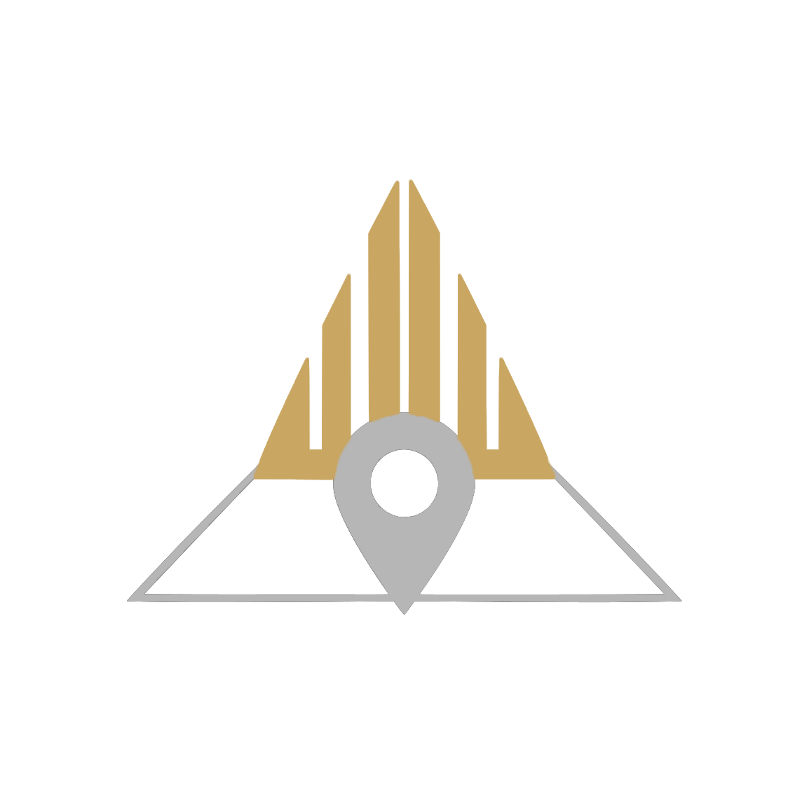
Vertical Bars
Represent growth and prosperity, inspired by the Sotho/Tswana meaning of “Leruo” (wealth).
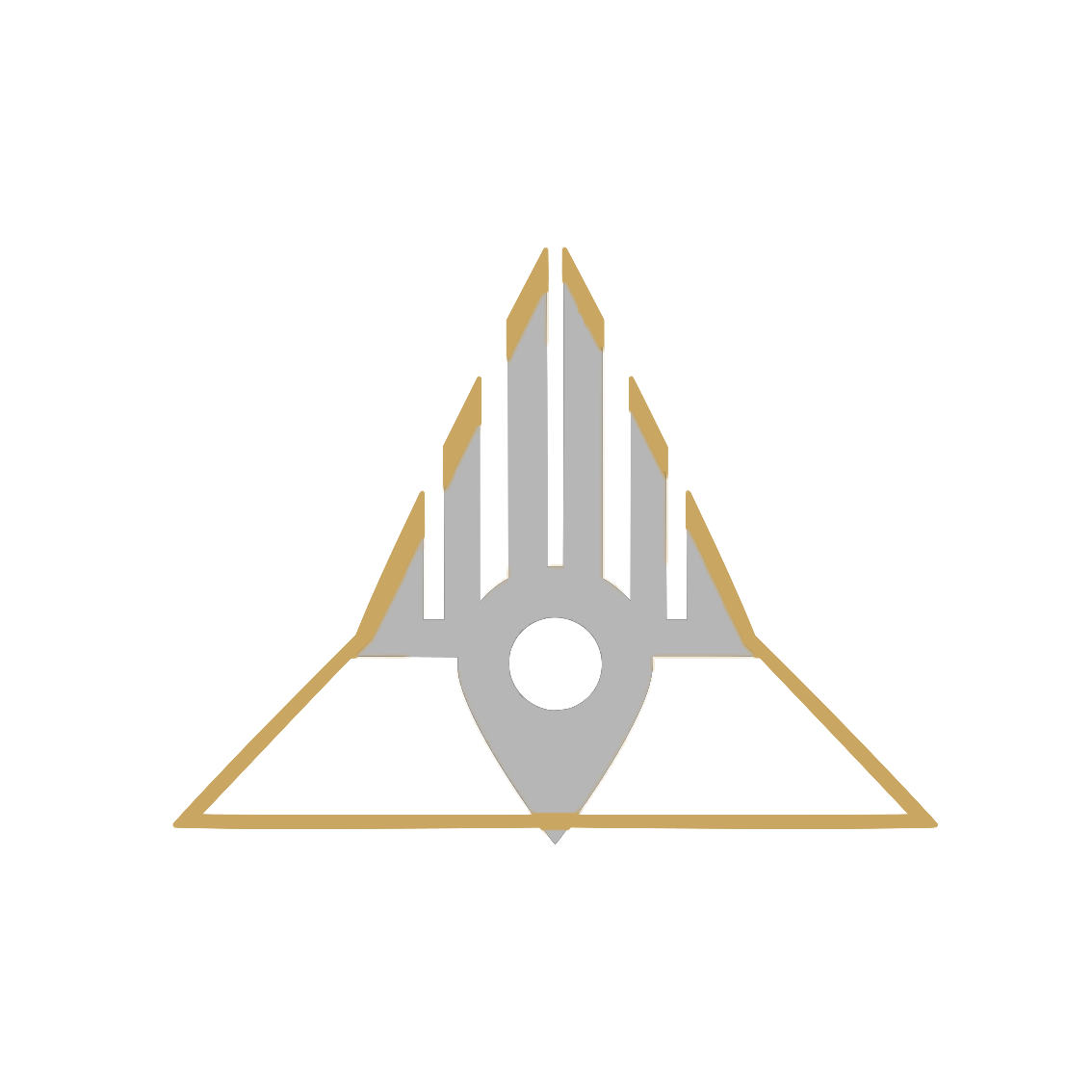
Triangle
The strongest geometric form, symbolizing stability and a solid foundation for the brand and its subsidiaries.
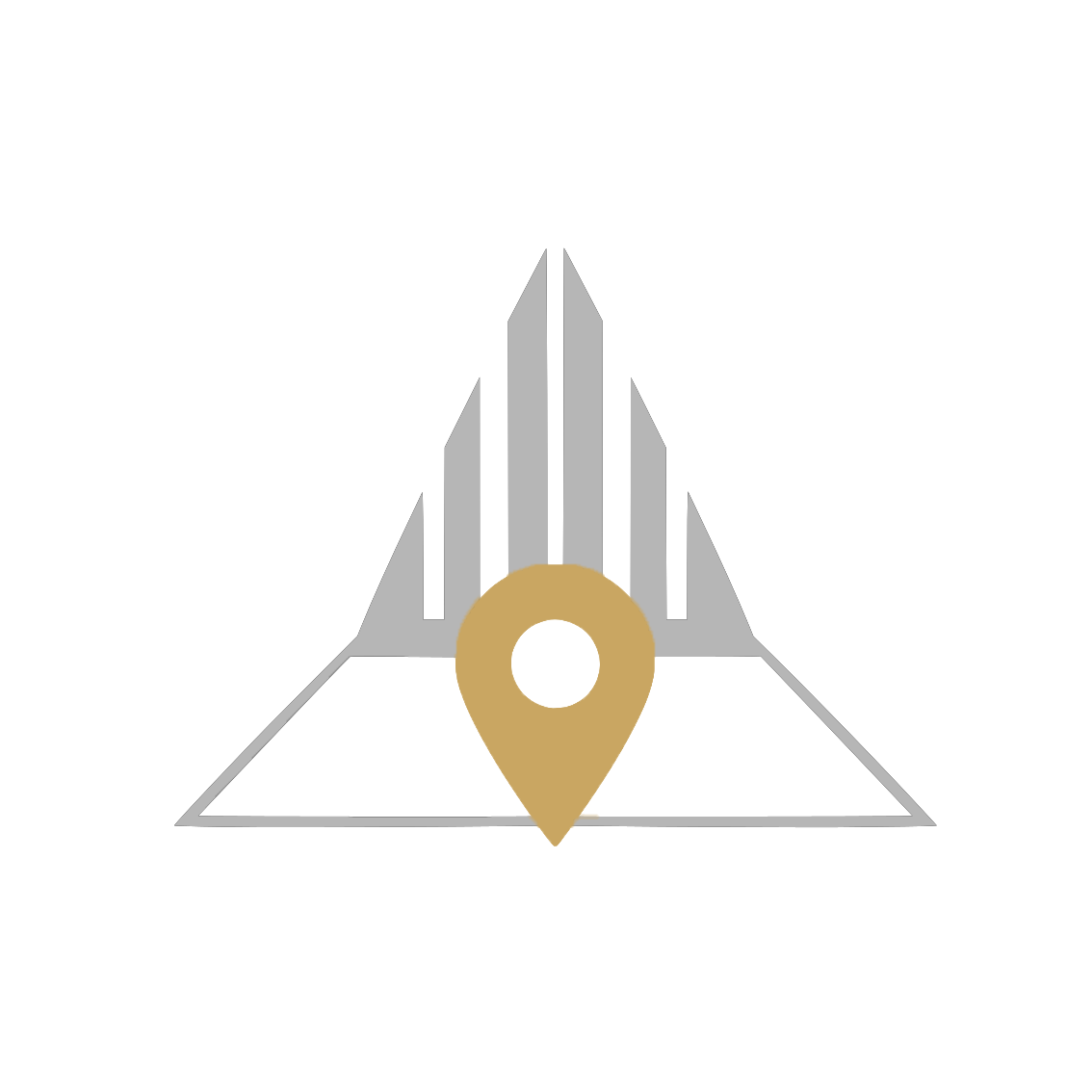
Location Pin
A subtle nod to the company’s transport and shuttle services, highlighting precision and reliability.